- Home
- Learning in public
- Sense-making notes
- Taking a Walk In Quinn's Mind
- Never Let Colour Carry Meaning Alone
Clark Quinnmentions using other clues rather than colour alone so that important coding can still be perceived by people who are colour blind.
In other words:
Giving our learners another way to recognize the same meaning.
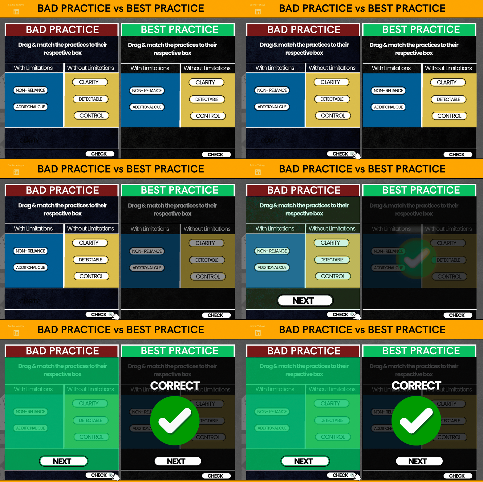
And So Instead of using only colours like green to communicate a correct response or red to communicate and in correct response like shown in the gif
🟢 Green = Correct
🔴 Red = Incorrect
we should make use of the color and a redundant cue like a text, symbol, sound or even a combination of two or more like shown in the gif below to help fill in the sensory gap for color blind learners.
🟢 ✓ Green = Correct
🔴 ✕ Red = Incorrect
And so the color will still be there, but it is no longer carrying the meaning by all by itself.
An addition of a Shape, Icon, Text, Pattern, Position, or Sound perhaps other perceptible cues can really go a long way in making the learning experience accessible for all types of learners regardless of senses disability type.
And So rather than color alone equating to a meaning
Color Alone → Meaning
Colour and one or more redundant cue are used together to communicate a meaning
Color + Redundant Cue → Meaning
Day 40 of Instructional Design
#InstructionalDesign#InstructionalDesigner#LearningAndDevelopment#Learni#SenseMakingNotes#MentalModels#TAWIQM#QuinnSeeds
In case you missed the Quinn Seed articles 👇
Quinn Seed #1- CLICK ME
Quinn Seed #2- CLICK ME
Where this comes from
- Check out "Learning Science" by Clark Quinn — If you design learning, teach, or train people, you need to understand what is actually happening when someone learns. Learning happens at the neural level, but we design for it at the cognitive level. There’s a lot more in Clark Quinn’s book that I can’t share because of **intellectual property**. Get the book and experience the learning yourself. 📚You Would Love It!
- Check out "40 L&D Stakeholder Challenges: Of L&D Leaders, Practitioners, Clients, and Learners" by Guy W. Wallace — This book shares the answers I got from my EPPI-PACT Guidance Bot. The free EPPI-PACT Guidance Bot is a digital, interactive knowledge-transfer resource designed to help Learning and Development (L&D) practitioners, performance consultants, and business leaders master and apply Guy W. Wallace’s Performance Improvement and Performance Based L&D methodologies.
- To Learn More Join the "Learning Development Accelerator" — Click the link to join the Amazing Learning Development Accelerator Group Where practice meets evidence